
Cottagecore and farmhouse decor both use natural materials and soft, muted colors, which is why they’re so often confused. But the two styles come from different inspirations and read very differently once you know what to look for.
Color Palette
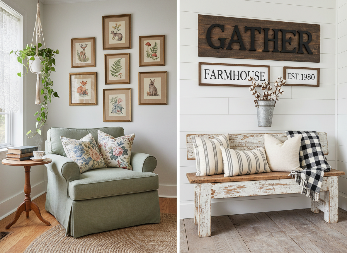
Farmhouse decor leans heavily on black, white, and gray with the occasional wood accent. Cottagecore uses a warmer, more varied palette — sage green, dusty pink, cream, and earthy brown — pulled from a garden or forest rather than a barn.
Wall Art Subjects
Farmhouse wall art tends toward signage, typography (“Gather,” “Home Sweet Home”), and roosters or barn imagery. Cottagecore wall art is almost always illustrated — woodland animals, mushrooms, florals, and whimsical nature scenes rather than text or farm signage.
Overall Mood
Farmhouse aims for clean, practical, and a little rustic. Cottagecore aims for whimsical, nostalgic, and a little magical — closer to a storybook than a working farm.
Can You Mix Them?
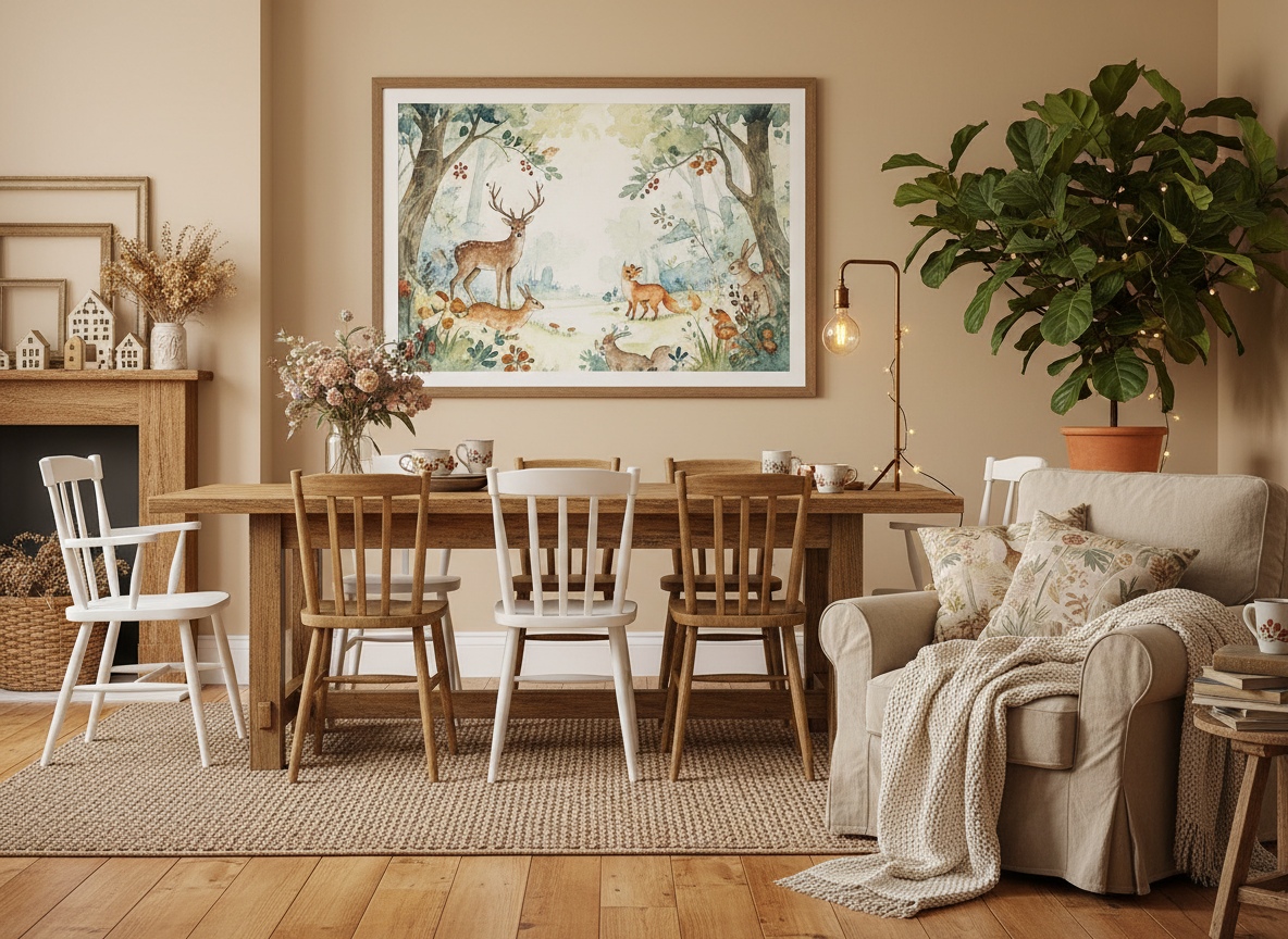
Yes — many homes blend both, using farmhouse furniture (a simple wood table, shiplap) with cottagecore wall art and textiles layered on top. The wall art is usually what tips a room toward one style or the other.
Shop the Look
If you’re leaning cottagecore, browse our woodland and botanical prints on Etsy to bring that warmer, more whimsical mood into your space.
 Cottagecore Prints
Leave a comment